JULIANA GAVIORNO
DIGITAL DESIGN
New Westminster
Farmers Market
Project type
Date
Brand Strategy and Redesign
November 2024
Role
Graphic Designer


Who doesn’t love a farmers market?
With long summer days and the comforting sense of community, it evokes a feeling of warmth and home. That sentiment is at the heart of this logo’s design.
To convey friendliness, comfort, and a welcoming, homey atmosphere, I chose a rounded typeface and lettermark — soft edges that instantly feel approachable and familiar.
The inclusion of carrots adds a playful yet meaningful touch. Carrots often bring to mind bunnies — gentle, friendly creatures that evoke joy and innocence. This association reinforces the brand’s warm and inviting personality.
At the same time, the logo remains clean, simple, and highly recognizable — qualities essential for strong, effective communication with its target audience.

Brand Pyramid

The New Westminster Farmers Market (NWFM) is a non-profit organization committed to fostering a vibrant and successful market experience for the local community.
My role involved redesigning their logo to better engage the New Westminster audience, capturing the organization's voice through a blend of humor and approachability. The design process was grounded in thorough research, community insight, and a collaborative approach to ensure the final identity resonated with both vendors and visitors alike.

Color Palette
Organic Shapes

Vector Illustrations

As a vibrant and sustainable brand, NWFM relies heavily on a palette of greens and oranges as a primary choice.
This palette is designed to be used together in a beautiful tonal range of secondary colors.
All colors were picked from fresh vegetables and fruits found on the market, such as orange, carrot, lettuce, radish, beets...
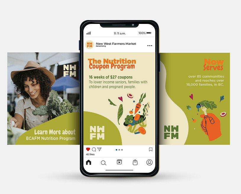
The use of organic shapes introduces a natural, fluid aesthetic that reinforces NWFM’s warm and approachable tone. These shapes reinforce the brand language and storytelling, creating a more organic and inviting atmosphere that resonates with the audience.
Incorporating vector illustrations into the brand adds a playful, approachable tone that sets the mood for NWFM as vibrant, fun, and welcoming. These visuals strengthen the brand language and enhance storytelling, making the overall experience more engaging and relatable for the audience.


